Gap’s Logo Misstep and Brand Consistency

Branding is an intricate dance between consumer perception and corporate intention. It has always been about more than just attractive logos or catchy slogans; it’s the very essence of a company’s identity. At the heart of a successful brand lies one crucial element: consistency.
Brand consistency serves as the anchor, ensuring that amidst the winds of change, the core values and recognizability of a brand remain intact.
However, when brands overlook this factor, the tide can quickly turn, as evidenced by Gap’s 2010 logo overhaul.
Gap’s 2010 logo redesign fail
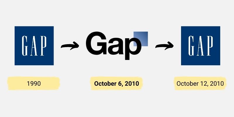
Gap, a brand synonymous with simple, classic American style, has been a staple in the closets of many for decades. But on the 6th of October 2010, this apparel brand made news for reasons other than its iconic denim or classic white tees. Instead, it was a graphic design decision that captured attention.
Gap introduced a new logo. This wasn’t a minor tweak but a radical departure from the emblem that consumers used to recognize and love. For years, Gap’s logo was elegantly straightforward: the name “Gap” spelled out in bold, white serif font set against a rich, dark blue square. It was a logo that, whether seen on shopping bags or storefronts, instantly evoked images of classic Americana fashion.

The new design was markedly different. Gone was the bold blue box that had framed the brand name. Instead, the website showcased the word “Gap” in a Helvetica font against a plain white background. To the top right of the ‘p’, a tiny blue square perched — a mere ghostly reminder of the logo that once was.
This transformation wasn’t just in the color scheme or layout; it signified a shift in branding. The old logo’s chunky letters and prominent blue square exuded a sense of comfort, reliability, and timelessness — values that many associated with the brand. The redesigned logo, with its sleeker typeface and the de-emphasized blue square, seemed to aim for a modern, minimalist aesthetic. But in trying to look towards the future, the brand seemed to have overlooked the deep-rooted nostalgia and affinity consumers held for the original design.
The reaction was swift and vast. While changes can often elicit a variety of responses, the magnitude of disapproval was something Gap might not have anticipated.
Gap responds
Big corporations often have the resources to navigate through criticisms and missteps, but the true challenge lies in recognizing and rectifying them. Gap did just that.
Marka Hansen, the person helping Gap in North America, engaged directly with the public, primarily through Gap’s Facebook page. Her message, embedded in humility and realization, highlighted a missed connection – the engagement with the vast online community that had been the backbone of Gap’s success.
This wasn’t Gap’s first rodeo in branding, but the incident underscored the need for brands to tread carefully, ensuring that their core audience remains a part of their evolutionary journey.
The importance of brand consistency
Harmony across all touchpoints
When we talk about branding consistency, we’re referring to the coherent and harmonious presentation of the brand across various platforms, be it digital, print, or physical. Whether a customer is browsing a company’s website, flipping through a brochure, or stepping into a physical store, the experience should feel seamless.
The colors, logos, typography, and even the voice and tone of communication should be uniform. This creates a solid brand recall value, ensuring that customers can easily identify and resonate with the brand wherever they encounter it.
The psychology of familiarity
From a psychological perspective, humans are wired to find comfort in familiarity. We tend to gravitate toward what we know. When customers repeatedly encounter the same branding elements, it fosters a sense of recognition and trust. It’s like seeing a familiar face in a crowd – there’s an instant connection.
The risk of inconsistency
On the flip side, when branding elements are inconsistent, it can jar the customer’s experience. Imagine the confusion if a company used different logos on their website and physical products or changed their color scheme frequently. Customers might wonder if they’re interacting with the same brand or a counterfeit. Over time, such inconsistencies can erode the trust customers have in the brand.
Furthermore, inconsistency can convey a message of carelessness or lack of attention to detail, suggesting that if a company cannot maintain uniformity in its own branding, how can it ensure quality and reliability in its products or services?
Beyond visuals: message and values
Consistency in branding goes beyond just visuals. The company’s messaging, ethos, and values should resonate in every piece of content and communication. A brand known for its sustainability efforts, for instance, should consistently promote and uphold these values across all channels. Any deviation, like suddenly endorsing non-environmentally friendly practices, can feel like a betrayal to its loyal customers.
The emotional connect
Branding is as much emotional as it is visual. When consumers grow attached to a brand, it’s often because they’ve formed an emotional bond based on shared values, positive experiences, and consistent interactions. Change this formula suddenly, and it’s akin to changing the personality of a close friend. The feeling of alienation can be profound.
As businesses evolve and seek to reinvent, they must tread carefully, ensuring that their core identity remains unaltered, resonating with the trust and loyalty they’ve nurtured over the years. Gap’s journey underscores that while innovation is pivotal, it should never come at the cost of the brand’s essence.
